Item Styles
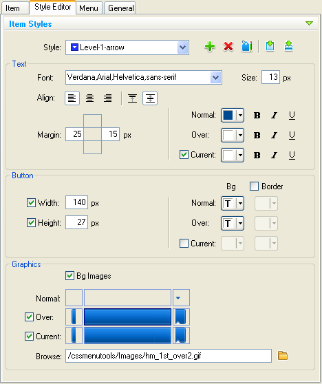
Style Editor Item Styles group contains the style editor. Here you can create new item styles or modify existing.
Select the style you wish to edit.
Manage the styles by using the buttons:
|
|
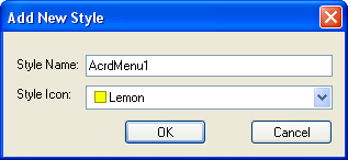
Create new style. Here you can enter a name and assign an icon-marker to this style. All the items that have this style applied would be marked with this icon on the menu tree view. You can change these details at any time.
NOTE: Every new style that you add into a list has all the parameters of the currently selected style. HINT: You can call styles suitable for its locations i.e. Level-1 for first-level items or Level-1-arrow for first-level items with submenu. Icons with arrow are also usually used to mark items with submenu. This would help you much at further usage. |
||||||
|
|
Delete the selected style. You can not delete a style applied to any item. |
||||||
|
|
Rename selected style. The Edit Style Title dialog will appear. Here you can change the selected style name and icon-marker. |
||||||
|
|
Apply the selected style to the menu item currently selected in the menu tree. |
||||||
|
|
Apply the selected style to the selected level items. You can make a choice.
See Menu Levels understanding for details. |
States
To describe the Item Style options we need some additional explanations about the item states.
The menu item may have up to three states.
They are:
Normal - mouse is out of item.
Over - mouse is over the item
Current (optionally) - highlighting menu item which is linked to the current page.
Text group
Font
Choose a font face from the drop-down list or type it directly.
Size
Set the font size. You can specify the size in pixels.
Align
Set text alignment. Buttons ![]()
![]()
![]() set horizontal text alignment: Left, Centered, Right. Next two buttons
set horizontal text alignment: Left, Centered, Right. Next two buttons ![]()
![]() set vertical text alignment: Top, Centered. These buttons are accessible if the Button Width and Height options are defined. Otherwise the button size depends on the item text.
set vertical text alignment: Top, Centered. These buttons are accessible if the Button Width and Height options are defined. Otherwise the button size depends on the item text.
Margin
Set the Text margins in pixels - spacing between the text and button edges.
NOTE: If you define Horizontal Align to Center then Left and Right margins are disabled. If you define Vertical Align to Center then Top and Bottom margins are disabled.
Text Color and Font style
You can set different color, bold (B), italic (I) and underline (U) style to text for the item states.
How to set colors see Color Picker.
Width
Turn Width check box on if you want set button width for menu item then enter the width in pixels. If this option is not defined the button width is calculated as a sum of the text width and its left & right margins.
Height
Turn Height check box on if you want set button height for menu item then enter the height in pixels. If this option is not defined the button height is calculated as a sum of the text height and its top & bottom margins.
Background and Border Color
You can set different background and border color for the item states. Also you can set ‘transparent’ color for background.
How to set colors see Color Picker.
Graphics group
Bg Images
Turn Bg Images check box on if you want to use background images.
Turn Over check box on if you want to use different images in over state from normal images.
Menu Item background can be composed using up to three images: left and right edges and middle image (repeating horizontally). Text will appear within the middle part only so the edges can be reviewed as additional margins for text.
Select the image box you wish to edit and type the image path in the edit box or browse image file by Browse button.


