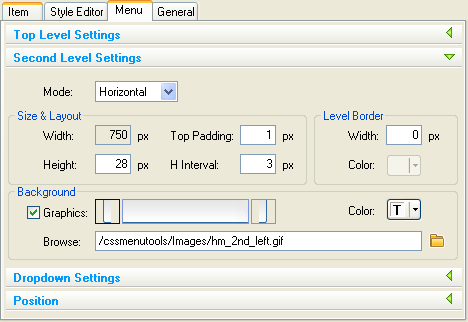
Second Level Settings
Menu Second Level Settings group enables you to set the second level menu parameters.
Mode
You can choose the second level type as Dropdown or Horizontal.
If it is defined as Dropdown then the second level has all the parameters defined in Dropdown Settings panel.
If it is defined as Horizontal then the second level appears horizontally and all the parameters of Second Level Settings panel are applied on it.
Size & Layout group
Width
Second level width is always equal to Top level width.
NOTE: please make sure your second level content is always fits to the menu width.
Height
Turn Height check box on if you want set second level height then enter the height in pixels. If height value is not specified, the second level height will be determined by its content.
Top Padding
Enables to set the top padding in pixels for the second level.
H Interval
Enables to set the horizontal interval (pix) between the items within the Second level. This option value(if positive) also defines the very left and right padding on the level. You can use the negative values for this option in some special cases, e.g. to get the items overlapped (each next over previous one). You can check the “Glossy Ice” preset to see how it works.
Level Border group
Width
Enables to set the Border Width for Second level.
Color
Enables to set the Border Color for Second level.
Background group
Turn Graphics check box on if you want to use background images. Second Level background can be composed using up to three images: left and right edges (if design requires) and middle image (repeating horizontally). The items (buttons) will appear within the middle part only so the edges can be used as additional margins.
Select the image box you wish to edit and type the image path in the edit box or browse image file by Browse button.
Color
Enables to set the Background Color for Second level.

